Skip to main content
Case Study: Pantone's Instragram Marketing Strategy

 For the past 50 years, the corporation Pantone Inc. has been the world-renowned authority on color and innovative color matching technology. The corporation is headquartered in Carlstadt, New Jersey, and they are best known for their Pantone Color Matching System which identifies, matches, and communicates colors to solve problems associated with producing accurate color matches in the graphic arts, fashion, home, interior, paint, and industrial design industries.
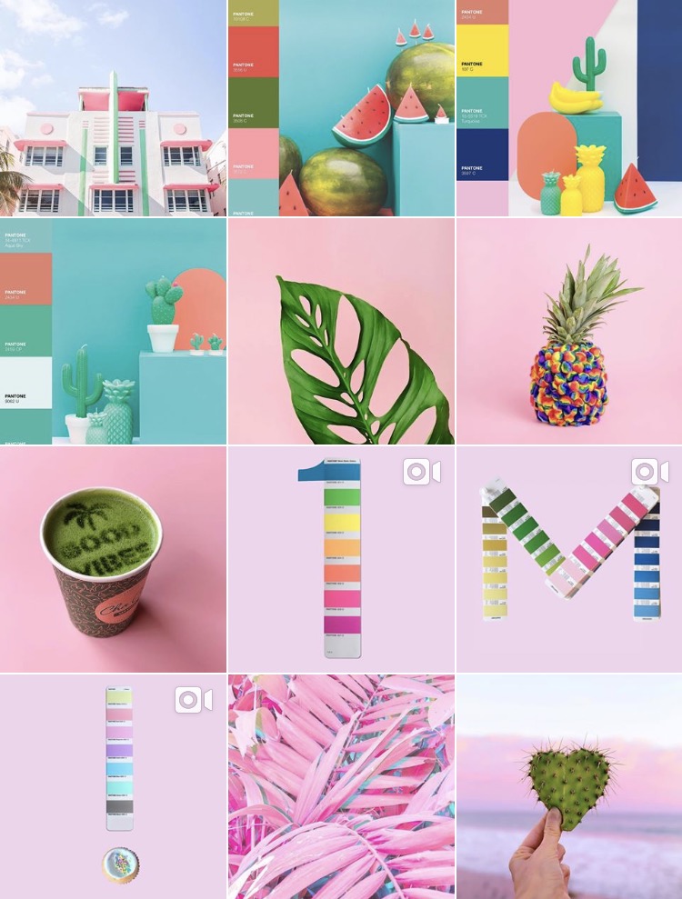
 Pantone keeps their high-quality status online with their effective advertisement campaigns on Instagram that helps them reach anyone from designers to manufacturers to retailers to artists. Instagram is all about the visuals and Pantone is all about color so in order to brainstorm possible subjects for the images that they post, Pantone first determines what aspect of their brand that they want to showcase. Since Pantone is known for having one of the largest catalogs of color in the world, showcasing that variety is a good marketing strategy for them.
 They come up with brilliant content themes by consistently using similar visuals in style and design and a palette of similar colors to help tell a better story of their brand. They use vibrant and colorful images to showcase their products and to increase interaction with their Instagram account.
Pantone does an excellent job of coming up with smart content themes for their Instagram account that helps their brand with marketing and advertising efforts. I personally think it's very creative how they come up with a list of patterns and colors and produce beautiful images that tell a story about a brand, then subtly move onto the next advertising campaign and set of colors. Pantone is a good example of developing an effective Instagram marketing strategy.
https://www.pantone.com/about-us
https://sproutsocial.com/insights/instagram-marketing-strategy-guide/
https://instagram.com/pantone
Comments
Post a Comment